The significance of appropriately sizing images for websites cannot be overstated. Images serve as powerful tools for conveying messages across landing pages, blog posts, or product pages. When meticulously chosen and presented, they possess the ability to captivate the attention of your ideal audience, thereby prolonging their stay on a page. Improperly uploaded images, particularly with large file sizes, can significantly slow down your website. This could prompt potential customers and Google bots to look for quicker alternatives elsewhere.
Images that are too large will slow down your website so much that potential customers and Google traffic will be directed to your competitors.
The use of correctly sized images can be the difference between making a sale or losing it to a competitor. Optimized web images can also draw customers to your site by improving its visibility in Google searches.
Regardless of whether you’re a project manager with ample resources to engage a professional or a solopreneur handling your website’s visual content independently, key factors should always be remembered when posting images.
Outlined below are essential guidelines that can provide you with a competitive edge in selecting and sizing high-quality images for websites:
Image Style: Landscape vs. Portrait
Choosing between landscape and portrait orientations might seem simple at first glance. However, it’s crucial to grasp the subtleties associated with each option.
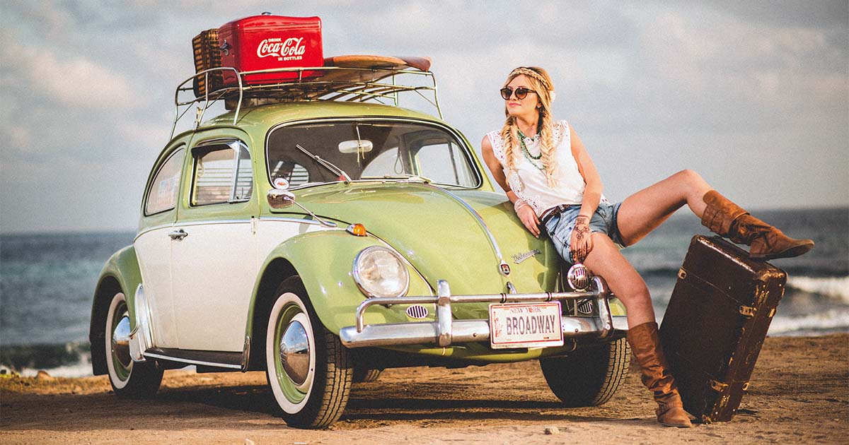
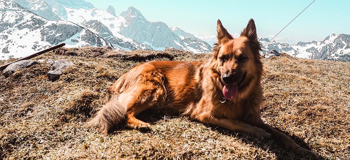
Landscape format images (horizontal) are commonly used at the top of web pages. It’s essential to ensure they adapt seamlessly to various screen sizes while maintaining quality. When an image is stretched on a wide screen, two issues may arise. It could either appear pixelated due to excessive stretching or lose focus on the main subject. To prevent pixelation, refer to the sizing guidelines provided below. To avoid losing focus, opt for images with a panoramic view rather than centered subjects.
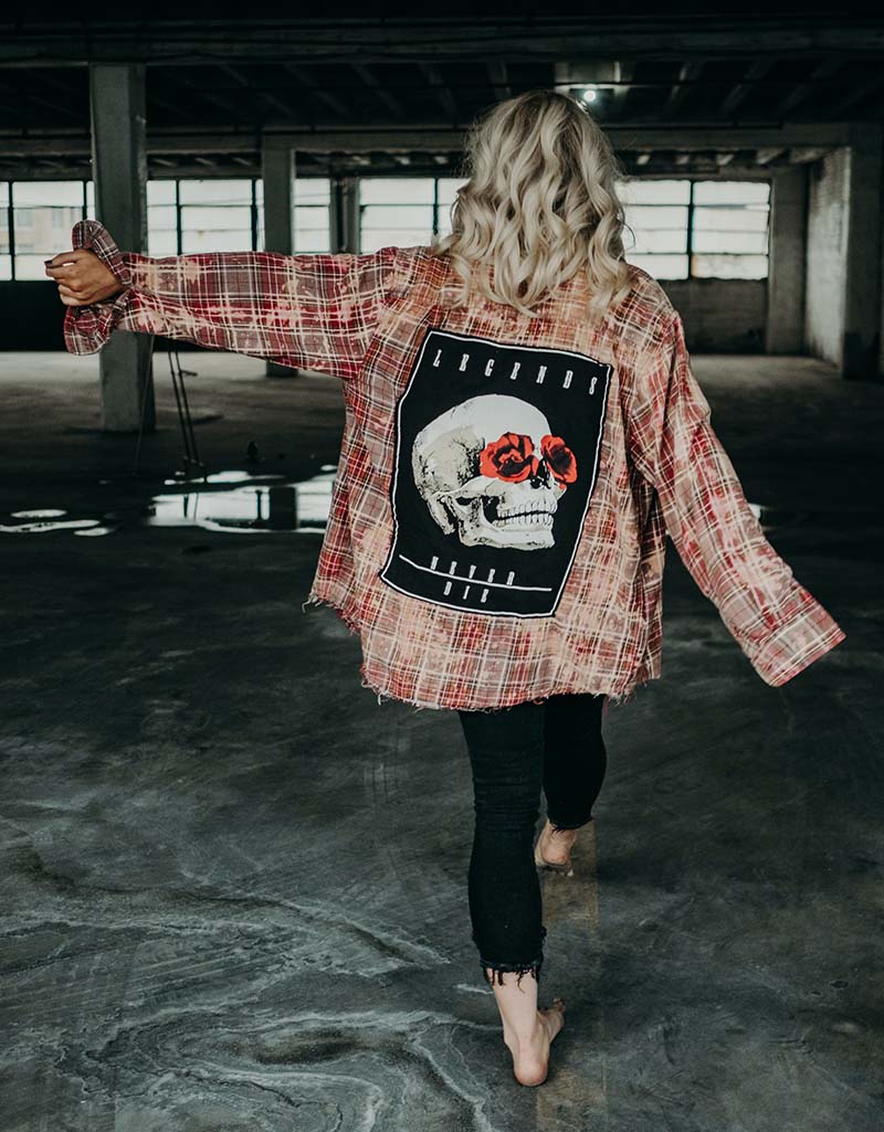
Portrait-oriented images (vertical) are ideal for illustrating content within a page’s body. For optimal outcomes, refer to the size guide provided below.
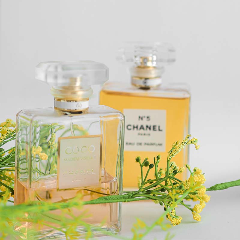
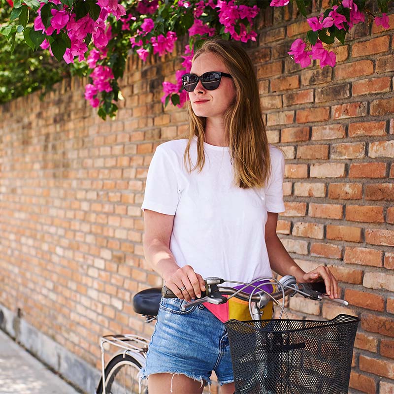
Product vs. Lifestyle
Product images aim to highlight the item, giving viewers a clear idea of what they’re buying. They show the product from different perspectives for a complete view. Lifestyle images show the product in real-life situations, making it relatable and connecting with customers on a personal level. These images evoke emotions and demonstrate practical uses of the product.
Consistency
Maintaining consistency in image style throughout your website is key to establishing a professional visual identity. Whether opting for monochrome tones or vibrant hues, adherence to a unified aesthetic enhances the overall user experience.
Image Quality
Undoubtedly, image quality is paramount. Beyond mere visual appeal, search engines like Google prioritize websites that feature high-quality content. Therefore, factors such as composition, color accuracy, and lighting warrant careful consideration when selecting images. Ensure your images are crisp and clear to capture the attention of users effectively.
Image Size
Precise image sizing is crucial for optimal website performance. Pixel dimensions and file sizes must align with recommended standards to ensure seamless loading across various devices and screen resolutions. For instance, WordPress suggests specific measurements for different types of images:
- Hero images (full-screen images): 2400 x 1600px (or any height preferred) and up to 1 MB
- Blog post heading: 1200 x 630px and no more than 200 KB
- Landscape feature image: 1200 x 900px and no more than 200 KB
- Portrait feature image: 900 x 1200px and no more than 200 KB
For responsive images, consider consulting a web developer to implement additional sizes. Alternatively, platforms like WordPress can automatically handle resizing based on predefined settings.
Image Optimization
Effective image optimization involves striking a balance between file size and visual fidelity. Compression techniques, coupled with the selection of appropriate file formats, are instrumental in achieving this balance. Before you even upload an image, tools such as Photoshop, Squoosh or ImageOptim can assist in compressing images without compromising quality. Additionally, be mindful of saving images in the correct file format:
- JPEGs: Ideal for compression to the smallest size
- PNGs: Suitable for images requiring a transparent background
- GIFs: Recommended for animations
- SVGs: Preferred for graphics
What’s in a name?
Get in the habit of giving relevant names to your images. This not only aids in locating photos in your media collection but also boosts SEO. Imagine your photo appearing on the first page of a Google search when users look for images, leading them back to your website and increasing awareness and traffic.
Additionally, alt tags play a vital role. These descriptions are essential for visually impaired individuals. By combining accurate descriptions with well-researched keywords, you can greatly improve your site’s search engine ranking and enhance user experience. It’s a win-win situation.
All in all, meticulous attention to image selection, sizing, and optimization is fundamental to creating a compelling and effective web presence.


